In 2022, as part of my master’s work at Queen’s, I wrote a paper with Filipe Cogo and Ahmed Hassan on the compatibility score that Dependabot attaches to its dependency update pull requests: Leveraging the Crowd for Dependency Management: An Empirical Study on the Dependabot Compatibility Score (PDF). The score is an attempt to answer a question every maintainer faces when a bot opens an update PR: is this new version safe to take? This post walks through what the score is, how we measured it, and what we found it can and can’t tell a maintainer.
What the Compatibility Score Is
Dependabot watches the dependencies a project declares. When one of them releases a new version, Dependabot opens a PR that bumps the dependency from the version the project uses (the origin version) to the new one (the target version), and the project’s CI runs against that branch.
Because Dependabot opens the same kind of PR in many projects at once, it sees how that update fared across all of them. The compatibility score is that crowd’s verdict. For a given update, identified by the tuple (provider package, origin version, target version), it’s the fraction of PRs whose CI passed:
compatibility_score = successful_updates / candidate_updatesNot every PR counts. A PR is a candidate update only if the project has CI configured and its main branch was passing before the update, so that a failure can reasonably be blamed on the dependency. A candidate is successful if CI still passes with the update applied. The project doesn’t have to merge the PR for it to count.
The score is shown as a badge on the PR, but only once an update has at least 5 candidate updates. Below that, the badge says “unknown”.
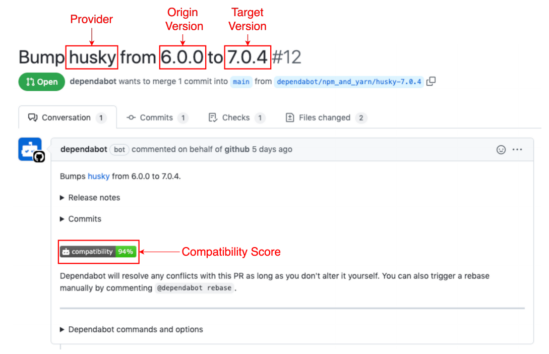
Here’s what that looks like on a real Dependabot PR. The title names the provider, origin version and target version, and the badge in the PR description shows the score for that update.
How We Measured It
The diagram below shows the whole collection pipeline, from finding projects on BigQuery to the two datasets the analysis runs on.
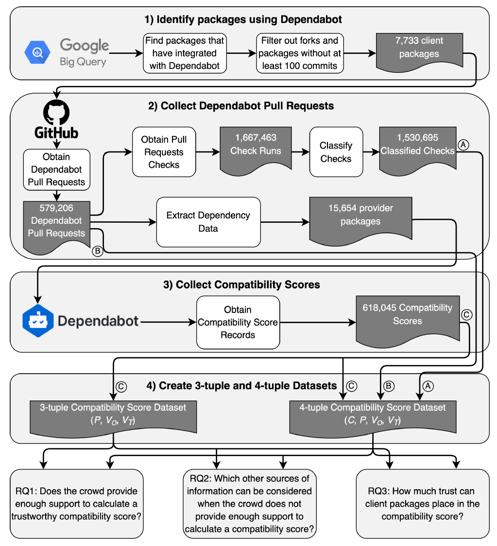
We used Google BigQuery to find GitHub projects with commits authored by Dependabot, then kept non-forked projects with at least 100 commits. That left 7,733 projects. From those we pulled every Dependabot PR between June 2017 and June 2021 through the GitHub API: 579,206 PRs. For each PR we parsed the provider, origin and target versions out of the title and collected the CI checks that ran on it.
We then queried Dependabot’s own API for every compatibility score it had recorded for each provider package we saw, which gave us 618,045 score records. That produced two datasets:
- The 3-tuple dataset is every score Dependabot had recorded, keyed by (provider, origin, target). It’s the complete picture of what scores exist, but it doesn’t say which projects contributed to them.
- The 4-tuple dataset links each score back to a specific Dependabot PR in one of our projects, keyed by (client, provider, origin, target). It’s smaller and skews towards popular updates, but it lets us ask whether the project merged the PR.
Only 38% of the Dependabot PRs had any CI configured at all, so most PRs never become candidates. To judge what the candidates were actually testing, I classified each CI check by its name into build, test, lint, deploy, security analysis, or “useless”, meaning checks that say nothing about compatibility, like one that labels the PR or uploads logs somewhere. Build checks were the most common at 58%, mostly because many projects run their whole pipeline as a single check, and 11% of checks were useless.
Most Updates Never Get a Score
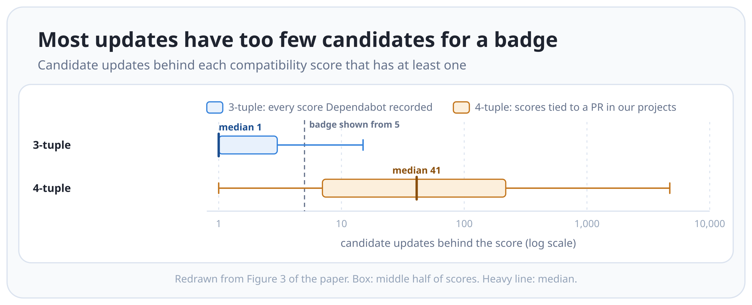
Only 17% of the updates in the 3-tuple dataset reached the 5-candidate threshold. The other 83% show “unknown”. That’s despite Dependabot opening hundreds of PRs for some new releases: the candidates for a provider get split across every origin version projects happen to be on, so each (origin, target) pair gets only a few. The real proportion is probably lower still, since Dependabot’s API only returns updates with at least one candidate.
The 4-tuple dataset, which skews towards popular packages and versions, did better: 83% had enough candidates for a badge, with a median of 41 candidates.
The chart below shows how many candidate updates sit behind each score in both datasets, on a log scale, with a dashed line at the 5-candidate threshold. Three quarters of the 3-tuple scores have 3 candidates or fewer, so most of that box sits left of the line.
When a badge does appear, it almost always reads high. The next chart shows the scores themselves for the updates with at least 5 candidates.
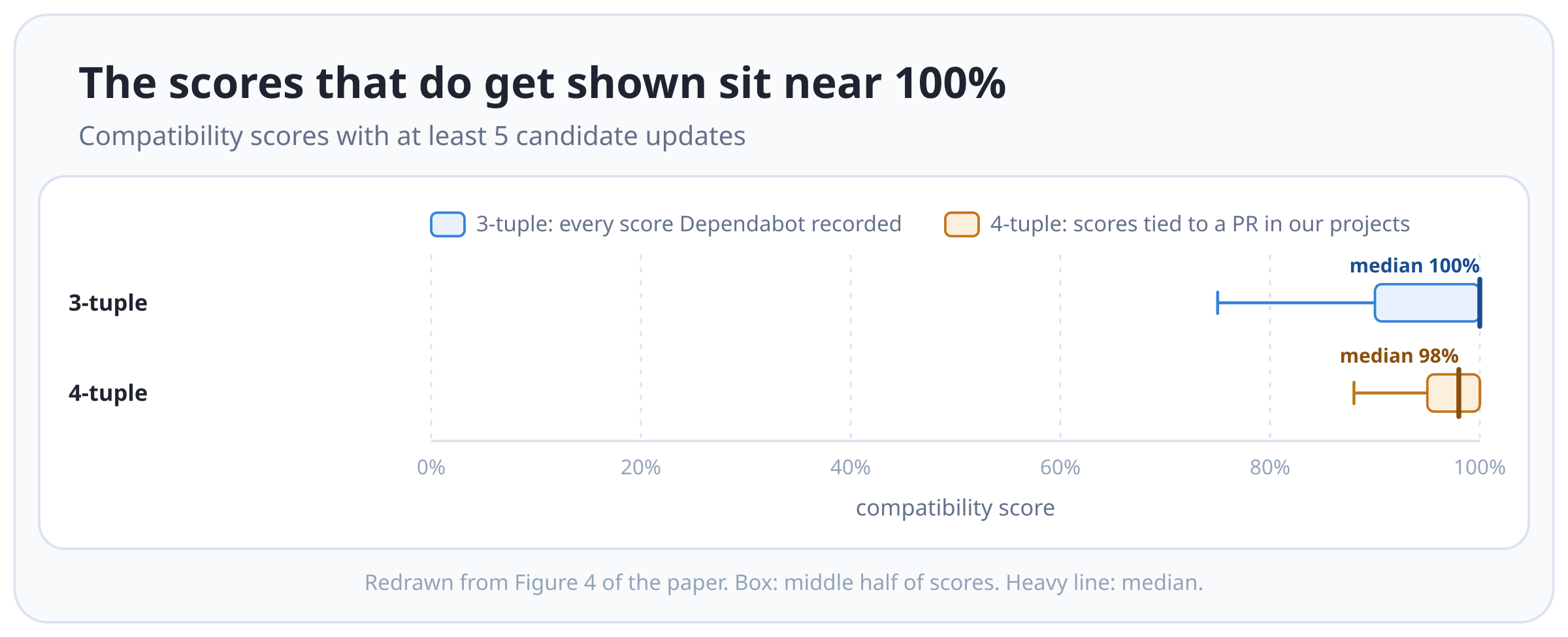
Among these scores, 76% (3-tuple) and 89% (4-tuple) were above 90%. A maintainer looking at these badges is mostly choosing between scores in the 90s, which isn’t much of a range to make a decision with.
Widening the Crowd, and Looking at the Client
Since the crowd is usually too thin, we looked at two other sources of information Dependabot already has.
The first widens the crowd. Instead of only counting candidates from
the exact origin version, count every origin version within the same
patch range (x.y.*), minor range (x.*.*), or
major range (*.*.*) that updated to the same target. This
borrows the logic of semantic versioning: an update from 2.0.1 to 2.0.4
and one from 2.0.2 to 2.0.4 should behave about the same. Using the
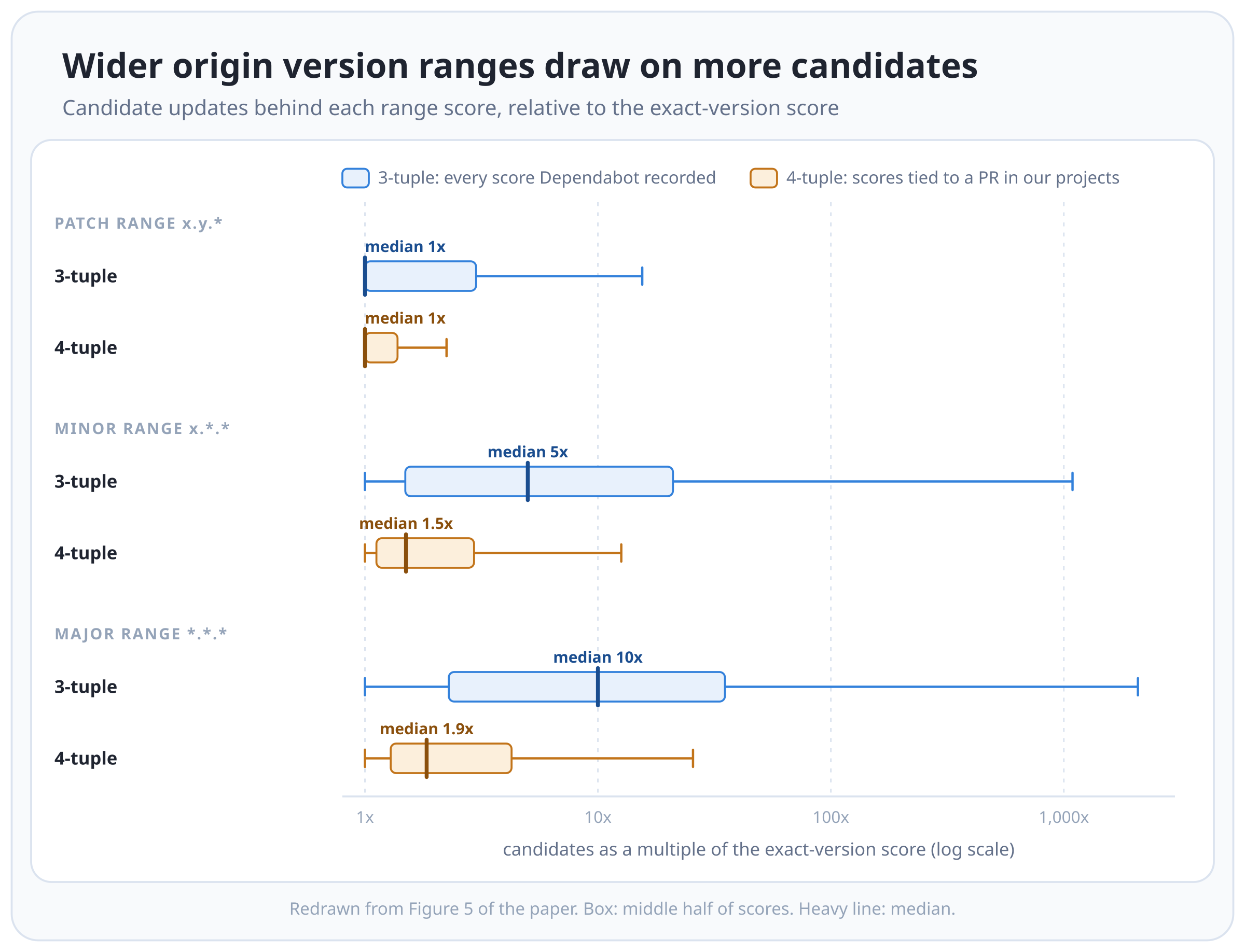
minor range gave the median 3-tuple score 5x as many candidates, and the
major range 10x. The share of 3-tuple scores that reach the 5-candidate
threshold went from 17% to 39%, 68% and 78% for the patch, minor and
major ranges. The cost is that the wider the range, the less the score
describes the exact update in front of the maintainer, and major ranges
can include intentional breaking changes.
The chart below shows, for each range, how many candidates the range score draws on as a multiple of the exact-version score. The gain is much smaller for the 4-tuple scores, with medians of 1x, 1.5x and 1.9x.
The second looks at the project’s own history with Dependabot: how many of its earlier Dependabot PRs passed CI, and how many it merged, both overall and for this particular provider.
To test whether either helps, we trained random forest models to predict whether the project merged the PR, on 4-tuple PRs that had fewer than 5 candidates (the cases where the badge says “unknown”). We used the merge decision rather than the CI result because CI is a poor label on its own: in 28% of Dependabot PRs with failing CI, the project merged the update anyway, presumably because they knew the failure had nothing to do with the dependency. Each model was evaluated with the median AUC over 100 out-of-sample bootstrap iterations. The baseline used only the raw compatibility score, on PRs with 5 or more candidates, and reached a median AUC of 0.62. The origin version range model reached 0.64, the client history model 0.76, and both combined 0.80.
The chart below shows each model’s AUC across the 100 bootstrap runs, as a gain over the baseline’s median.
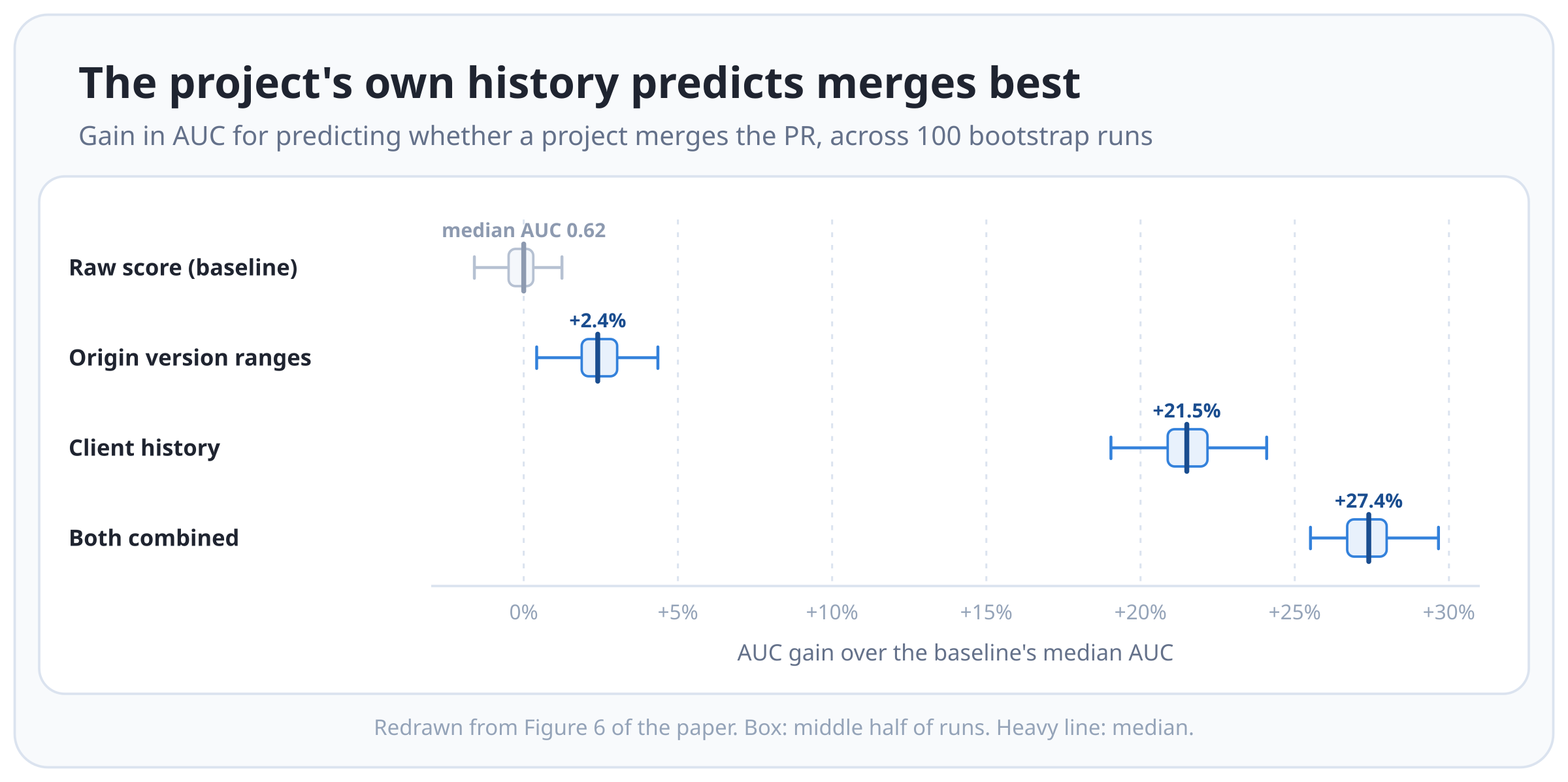
The main finding: the project’s own history predicts whether it’ll accept an update much better than the crowd does. The single most important feature in the client history model was how many Dependabot PRs the project had merged before. The widened crowd scores helped only a little on their own, though they added to the combined model. When we ran the same models on PRs that did have 5 or more candidates, the combined model still reached 0.78, against the baseline’s 0.62, so the client’s history helps even when the crowd is big enough to show a badge.
How Much to Trust a Score
A score of 100% from 5 candidates and a score of 99% from 100 candidates get the same badge, and the first looks better. The second is much stronger evidence.
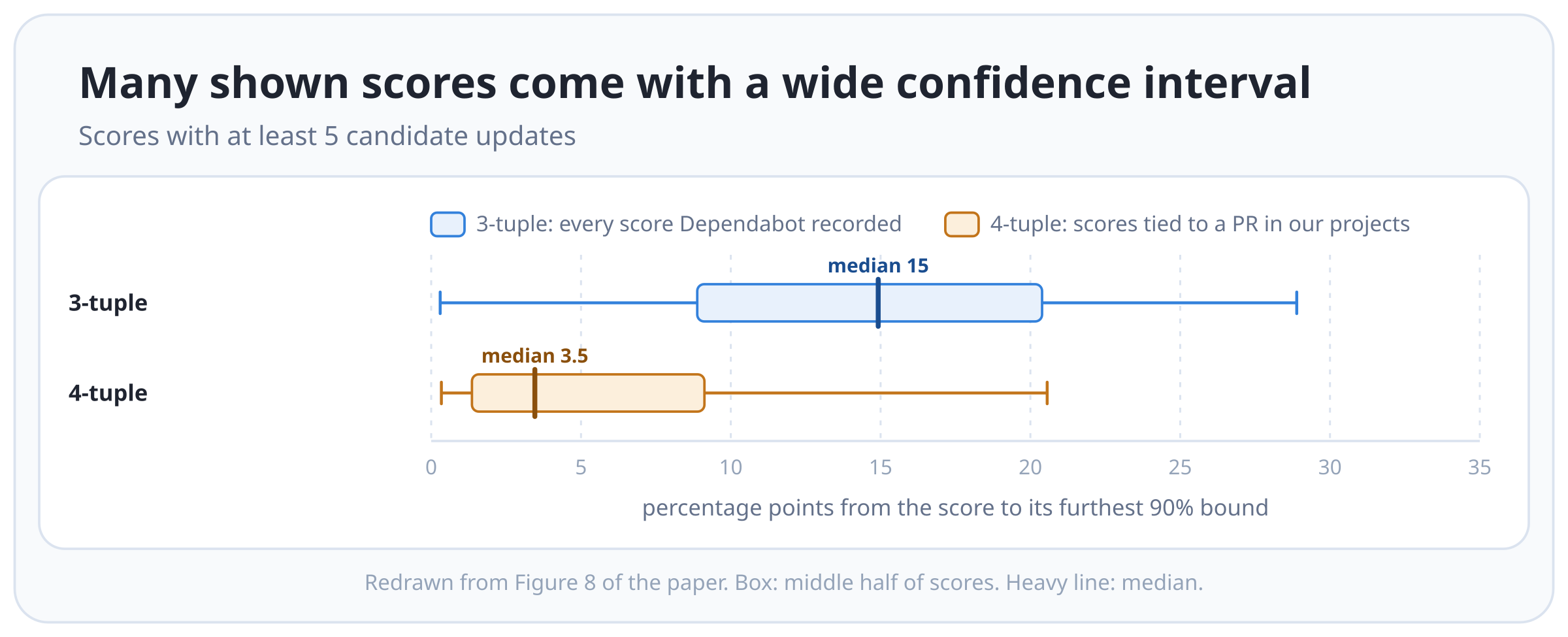
To put a number on that, we computed a 90% confidence interval for each score from its candidate and successful counts, and measured how far the furthest bound sat from the score. For half of the 3-tuple scores with at least 5 candidates, that distance was more than 15 percentage points. In the 4-tuple dataset, with more candidates per score, the median distance was 3.5 points. The chart below shows that distance across all scores with at least 5 candidates.
The badge looks the same either way.
The quantity of candidates is half of it; the quality is the other half. A candidate whose CI is only a linter counts exactly as much as one with build, unit, integration and deploy checks. Most candidates (94%) had at least a build or test check, though earlier research by Hejderup and Gousios found that project test suites often barely exercise their dependencies. A quarter of candidates had at least one useless check in their pipeline, and 1% had nothing but useless checks. Those useless-only PRs passed 94% of the time, slightly more than the 88% for PRs with a build check. They count as successful updates without having tested the dependency at all.
An Aside: Where the Interval Comes From
The score is a ratio from a handful of trials, so the question worth asking isn’t what the ratio is, it’s what true pass rate could plausibly have produced it. We answered that with Bayesian inference: treat the true rate as unknown, and treat the passes and failures we observed as evidence about it.
The distribution to put over that true rate is the beta distribution, which is defined on 0 to 1, the range a ratio lives in. Before any PRs have run there’s nothing to go on, so the prior is Beta(1, 1), the uniform case where every true rate is equally plausible. The successes are then binomial: for N candidate updates and an unknown true rate p, the number that pass is S ~ Binomial(N, p). Beta and binomial are conjugate, which means the posterior is another beta distribution and its parameters are just the counts:
a = 1 + successful_updates
b = 1 + failed_updates
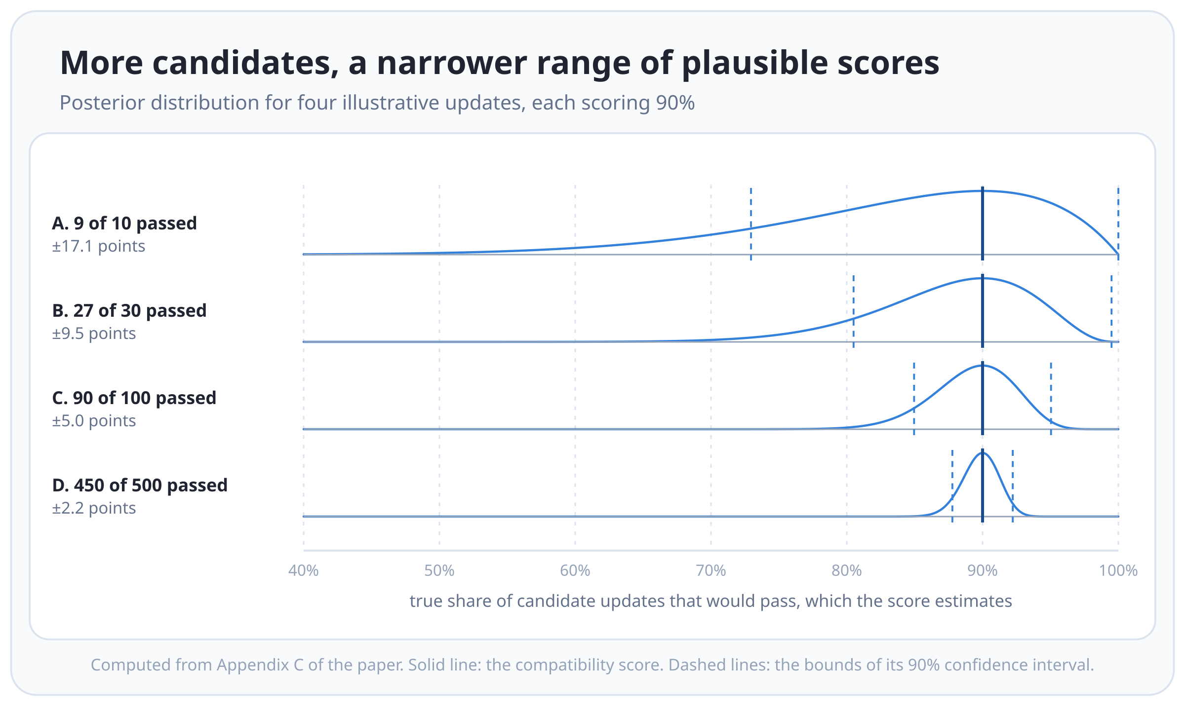
So an update where 9 of 10 candidates passed has a Beta(10, 2) posterior, and one where 450 of 500 passed, the same 90% score, has a Beta(451, 51). Both are centred in the same place; the second is far narrower.
The chart below puts four such updates on a shared axis. Every one of them scores 90%, and the only thing that changes down the rows is how many candidates produced that score, from 10 up to 500. Each row shows the posterior for that update, scaled to its own height, with a solid line at the score and dashed lines at the bounds of the interval. The range of pass rates the evidence can’t rule out shrinks as candidates accumulate, from plus or minus 17.1 points at 10 candidates to 2.2 points at 500.
From there we took a normal approximation to the posterior’s standard deviation, scaled it by the critical value for a 90% confidence level, and read the bounds off around the score:
sigma = sqrt(a * b / ((a + b) ** 2 * (a + b + 1)))
precision = 1.65 * sigma
interval = [max(score - precision, 0), min(score + precision, 1)]
Row A’s upper bound in the chart above lands exactly on 100% because of that clamp; the formula would otherwise put it past 107%.
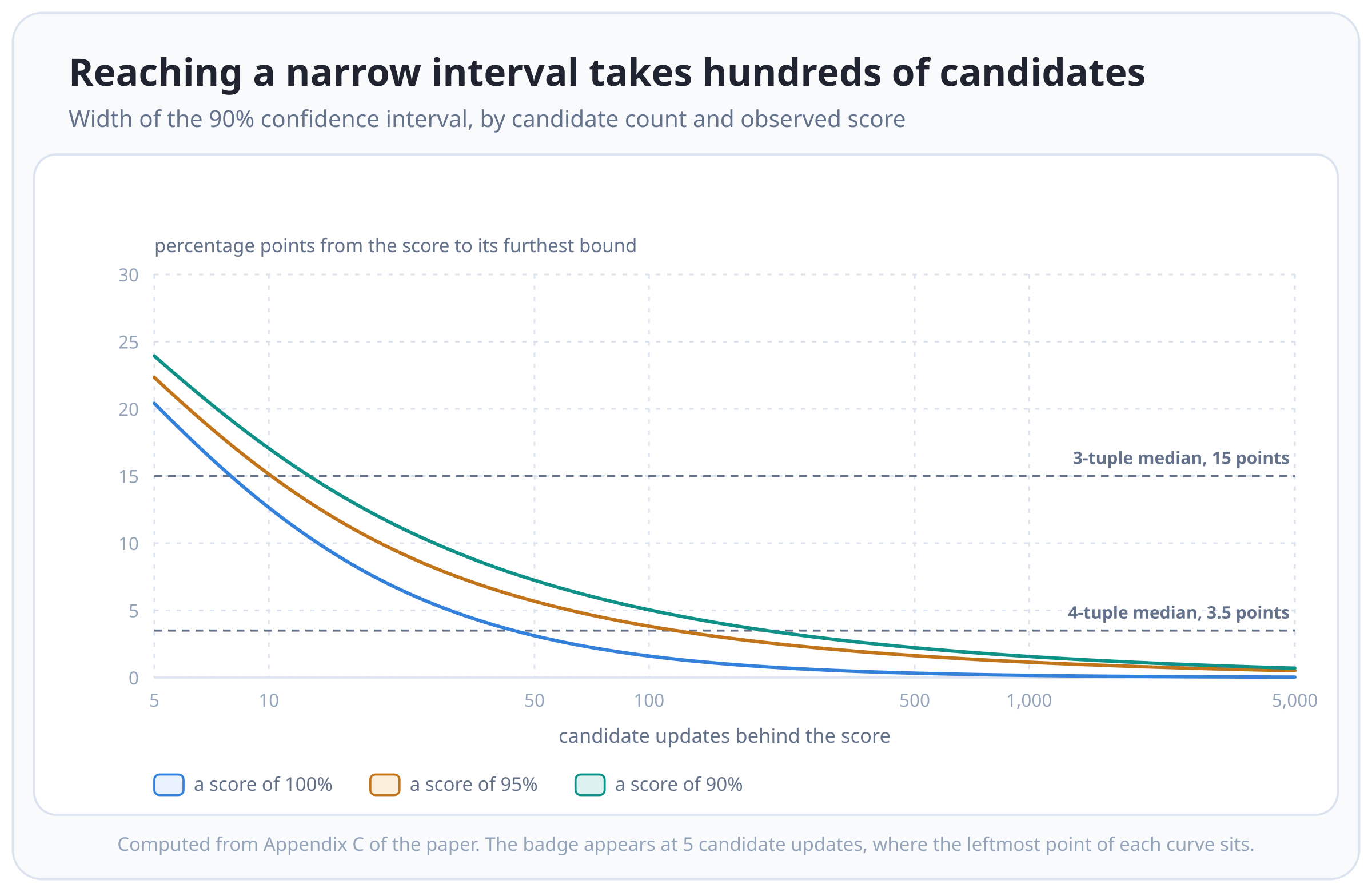
Plotting that precision directly gives the second chart:
the width of the interval against the number of candidates on a log
axis, for three observed scores, with the two medians above marked as
horizontal lines. At the 5-candidate threshold where the badge first
appears, the interval is at least 20 points wide whatever the score.
Getting it down to the 3.5 points that the 4-tuple scores reach at their
median takes somewhere north of 100 candidates, and the curve has
flattened out well before 1,000.
What the Score Tells a Maintainer
Put together, here’s how I’d read the badge as a maintainer:
- “Unknown” is the usual case, not an edge case.
- A high score with few candidates is weak evidence, and most shown scores are high.
- A passing candidate may not have tested anything. The project contributing that pass could have a pipeline that only labels PRs.
- If the project’s own CI passes, that’s another data point, but the project’s own PR is also one of the candidates in the score, so the two aren’t independent.
The paper closes with four recommendations for anyone building a dependency bot that leans on the crowd:
- When an exact update has too few candidates, widen to a range of origin versions, and say clearly that the score is for the range.
- When even that isn’t enough, use the client’s own update history to give a personalized score.
- Show a confidence interval or similar next to the score, so a 100% from 5 candidates doesn’t look better than a 99% from 100.
- Weight candidates by the quality of their CI, so that a pipeline that never touches the dependency doesn’t count as a pass.